Color Psychology in Design
Introduction: Psychology of Color in Design
The psychology of color in design: how colors communicate with the mind before the message reaches the eye. The psychology of color in design: color… a language everyone understands
Color is the first message in any design, a language that needs no translation
It is a feeling, a memory, energy, and a symbol-and every color tells a different story
Design that doesn’t understand color psychology loses half its power
Color as a Tool for Emotional Influence
Colors are not merely an aesthetic choice, but a psychological decision
Every color evokes an internal response
A calming color
An energizing color
A confident color
An appetizing color
A luxurious color
A color that brings back memories
A conscious designer doesn’t choose a color because it’s “beautiful,” but because it serves the message
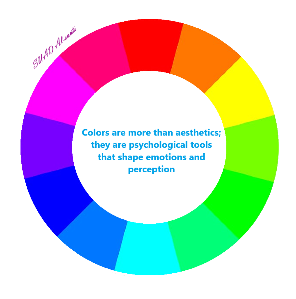
The Meanings of Basic Colors in Design
Blue – Trust, tranquility, and spaciousness. Associated with peace, professionalism, and depth. Used in companies, institutions, and projects that require credibility.
Red – Energy, power, and attention. The color of movement and passion. It immediately attracts attention, but its intensity requires caution.
Yellow – Inspiration, optimism, and light. The color of new ideas. It evokes a feeling of warmth, but excessive use can be irritating.
Green – Balance, growth, and nature. Symbolizes health, stability, and harmony. Suitable for health, environmental, and educational applications.
Black – Power, luxury, and mystery. A sophisticated and powerful color used in luxury brands.
Purple – Creativity, spirituality, and excellence. The color of artists and creators. Symbolizes imagination and depth
White – Purity, simplicity, and space. The color of creative space. Allows other elements to shine.
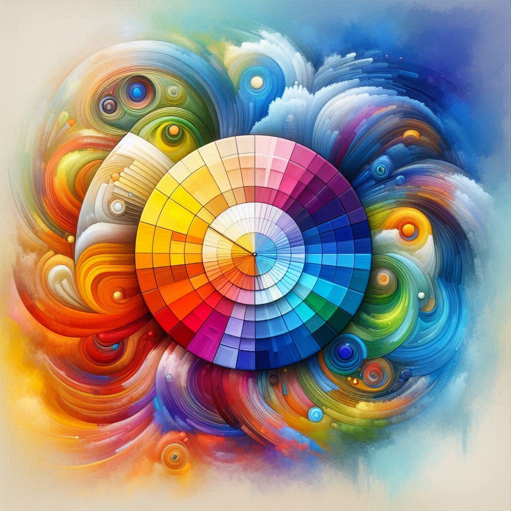
Color Harmony
How Do Colors Speak Together? Colors don’t work in isolation
They interact
: Color harmony is the art of choosing a color palette that is
Balanced
Harmony
Serves the message
And creates a comfortable visual experience
: The most common harmony techniques include
Color Psychology in Design
Contrast colors
Harmony colors
Monochrome colors
Triadic colors
Good harmony makes a design seem “comprehensible†even before you read it
Color as a tool
Color as a tool to guide the eye
Color is not just a sensation
It’s a map
:Color can
Establish a focal point
Guide the eye from one element to another
Highlight important information
Reduces design clutter
Creates visual rhythm
Color is the silent leader of eye movement
In summary: Color… the soul of design
Colors aren’t just layers added to a design; they are the soul that gives it life
They are what makes a design speak, feel, and leave a lasting impression
:When we understand the psychology of color, we become capable of
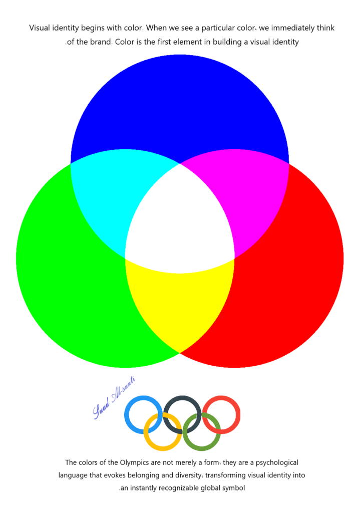
Visual identity begins with color
When we see a particular color, we immediately remember a brand
Color is the first element in building a visual identity
:Good color
Easily memorable
Distinguishes the brand
Creates an emotional connection
And becomes part of the project’s identity
…..Color isn’t a choice
It’s a strategic decision
Influencing
Persuading
Inspiring
And building an unforgettable visual experience
Color is the first word in the language of design
. And sometimes, it’s the most powerful word
Related articles
Design as therapy and innovation
And Art Psychology
Definition of the general concept of inspiration
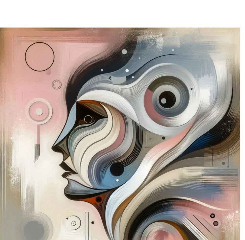
The language of light and pulse: Inner
Mind is Logical Philosophy
nspiration-through-silence
Design tells stories
Color Psychology in Design
Hardships breed innovation
Social media, and internal distance
Divine Inspiration Emanating from the Soul
Benefits of Social Media
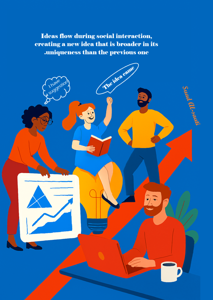
Ideas resulting from the interaction
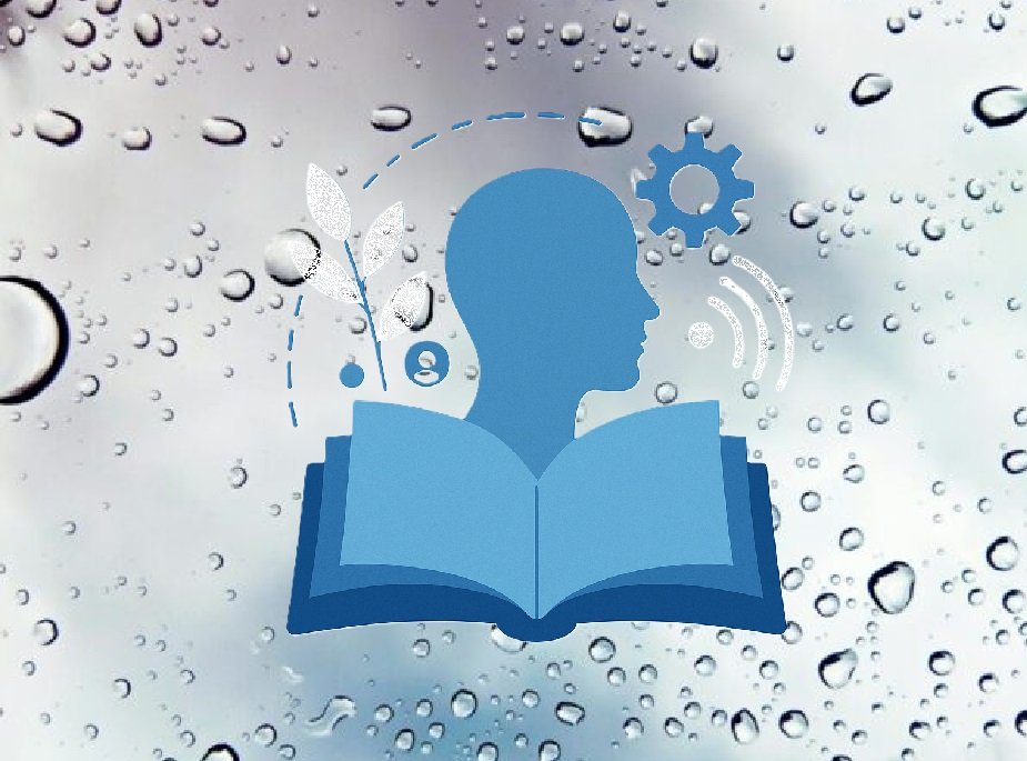
Spaces of Inspiration